场景
2023年01月23日
一、两栏布局
场景背景: 实现一个左宽为200px, 右宽自适应的两栏布局
场景解决: 通过项目 flex: 1 实现(flex: 1 === flex: 1 1 0)
实时编辑器
function Test(props) {
    const containerStyle = {
            width: '100%',
            height: '300px',
            backgroundColor: 'red',
            display: 'flex',
        }
        const leftStyle = {
            flex: "none", // flex: none === flex: 0 0 auto  不会缩短,也不会伸长
            width: "200px",
            backgroundColor: "yellow"
        }
        const rightStyle = {
            flex: 1,  // flex: 1 === flex: 1 1 0 即会缩短,也会伸长
            backgroundColor: "blue"
        }

        return (
            <div style={ containerStyle }>
                <div style={ leftStyle }></div>
                <div style={ rightStyle }></div>
            </div>
        );
}
结果
Loading...
二、三栏布局
场景背景: 实现一个左宽为200px, 右宽自适应的两栏布局
场景解决: 通过项目 flex: 1 实现(flex: 1 === flex: 1 1 0)
实时编辑器
function Test(props) {
    const containerStyle = {
            width: '100%',
            height: '300px',
            backgroundColor: 'red',
            display: 'flex',
        }
        const leftStyle = {
            flex: "none", // flex: none === flex: 0 0 auto  不会缩短,也不会伸长
            width: "200px",
            backgroundColor: "blue"
        }
        const centerStyle = {
            flex: 1, // flex: 1 === flex: 1 1 0 即会缩短,也会伸长
            backgroundColor: "yellow"
        }
        const rightStyle = {
            flex: "none", // flex: none === flex: 0 0 auto  不会缩短,也不会伸长
            width: "200px",
            backgroundColor: "blue"
        }

        return (
            <div style={ containerStyle }>
                <div style={ leftStyle }></div>
                <div style={ centerStyle }></div>
                <div style={ rightStyle }></div>
            </div>
        );
}
结果
Loading...
三、多列布局
场景背景: 需要有多列,并且有固定间距
场景解决: 通过 Flex 划分每一行的元素排列, 通过 Grid 中的 gap 属性规定间距
场景实现
实时编辑器
function Test(props) {
  const container = {
    width: "400px",
    display: "flex",
    gap: "24px 24px",
    flexWrap: "wrap",
    backgroundColor: "red"
  }
  const item = {
    width: "80px",
    height: "100px",
    flex: "1 1 auto",
    backgroundColor: "yellow"
  }
  return (
     <div style={ container }>
       <div style={ item }></div>
       <div style={ item }></div>
       <div style={ item }></div>
       <div style={ item }></div>
       <div style={ item }></div>
       <div style={ item }></div>
       <div style={ item }></div>
       <div style={ item }></div>
     </div>
  );
}
结果
Loading...
四、九宫格布局
场景背景: 实现九宫格布局
场景解决: 通过 display: flex; gap: 24px; 实现
实时编辑器
function Test(props) {
    const randomColor16 = ()=>{
        let r = ((Math.random() * 256) >> 0).toString(16);
        let g = ((Math.random() * 256) >> 0).toString(16);
        let b = ((Math.random() * 256) >> 0).toString(16);
        if (r.length < 2) {
            r = "0" + r;
        }
        if (g.length < 2) {
            g = "0" + g;
        }
        if (b.length < 2) {
            b = "0" + b;
        }
        return `#${r}${g}${b}`;
    }

    const containerStyle = {
        width: '300px',
        height: '300px',
        backgroundColor: 'red',
        display: 'flex',
        gap: "24px",
        flexWrap: "wrap",
    }
    const itemStyle = {
        flex: "auto",
        width: "80px",
        height: "80px",
        backgroundColor: randomColor16(),
    }

    return (
        <div style={containerStyle}>
            <div style={ itemStyle }></div>
            <div style={ itemStyle }></div>
            <div style={ itemStyle }></div>
            <div style={ itemStyle }></div>
            <div style={ itemStyle }></div>
            <div style={ itemStyle }></div>
            <div style={ itemStyle }></div>
            <div style={ itemStyle }></div>
            <div style={ itemStyle }></div>
        </div>
    );
}
结果
Loading...
五、水平居中布局
场景背景: 通过 flex 实现垂直居中布局
场景解决: 通过 justify-content: center; 实现
实时编辑器
function Test(props) {
    const containerStyle = {
        width: '400px',
        height: '400px',
        backgroundColor: 'red',
        display: 'flex',
        justifyContent: "center",
    }
    const itemStyle = {
        backgroundColor: "yellow"
    }

    return (
        <div style={ containerStyle }>
            <div style={ itemStyle }>嘻嘻哈哈</div>
        </div>
    );
}
结果
Loading...
场景解决特点: 项目不需要指定宽高,可以根据内容自适应居中
六、垂直居中布局
场景背景: 通过 flex 实现垂直居中布局
场景解决: 通过 align-items: center 实现
实时编辑器
function Test(props) {
    const containerStyle = {
        width: '400px',
        height: '400px',
        backgroundColor: 'red',
        display: 'flex',
        alignItems: "center"
    }
    const itemStyle = {
        backgroundColor: "yellow"
    }

    return (
        <div style={ containerStyle }>
            <div style={ itemStyle }>嘻嘻哈哈</div>
        </div>
    );
}
结果
Loading...
场景解决特点: 项目不需要指定宽高,可以根据内容自适应居中
七、两栏布局(上下)
场景背景: 实现一个左宽为200px, 右宽自适应的两栏布局
场景解决: 通过项目 flex: 1 实现(flex: 1 === flex: 1 1 0)
实时编辑器
function Test(props) {
    const containerStyle = {
            width: '100%',
            height: '600px',
            backgroundColor: 'red',
            display: 'flex',
            flexDirection: "column"
        }
        const leftStyle = {
            flex: "none", // flex: none === flex: 0 0 auto  不会缩短,也不会伸长
            height: "100px",
            backgroundColor: "yellow"
        }
        const rightStyle = {
            flex: 1,  // flex: 1 === flex: 1 1 0 即会缩短,也会伸长
            backgroundColor: "blue"
        }

        return (
            <div style={ containerStyle }>
                <div style={ leftStyle }></div>
                <div style={ rightStyle }></div>
            </div>
        );
}
结果
Loading...
八、三栏布局(上下)
场景背景: 实现一个左宽为200px, 右宽自适应的两栏布局
场景解决: 通过项目 flex: 1 实现(flex: 1 === flex: 1 1 0)
实时编辑器
function Test(props) {
    const containerStyle = {
            width: '100%',
            height: '800px',
            backgroundColor: 'red',
            display: 'flex',
            flexDirection: "column"
        }
        const leftStyle = {
            flex: "none", // flex: none === flex: 0 0 auto  不会缩短,也不会伸长
            height: "200px",
            backgroundColor: "blue"
        }
        const centerStyle = {
            flex: 1, // flex: 1 === flex: 1 1 0 即会缩短,也会伸长
            backgroundColor: "yellow"
        }
        const rightStyle = {
            flex: "none", // flex: none === flex: 0 0 auto  不会缩短,也不会伸长
            height: "200px",
            backgroundColor: "blue"
        }

        return (
            <div style={ containerStyle }>
                <div style={ leftStyle }></div>
                <div style={ centerStyle }></div>
                <div style={ rightStyle }></div>
            </div>
        );
}
结果
Loading...
九、水平垂直居中布局
场景背景: 通过 flex 实现水平垂直居中布局
场景解决: 通过 justify-content: center; align-items: center 实现
实时编辑器
function Test(props) {
    const containerStyle = {
        width: '400px',
        height: '400px',
        backgroundColor: 'red',
        display: 'flex',
        justifyContent: "center",
        alignItems: "center"
    }
    const itemStyle = {
        backgroundColor: "yellow"
    }

    return (
        <div style={ containerStyle }>
            <div style={ itemStyle }>嘻嘻哈哈</div>
        </div>
    );
}
结果
Loading...
场景解决特点: 项目不需要指定宽高,可以根据内容自适应居中
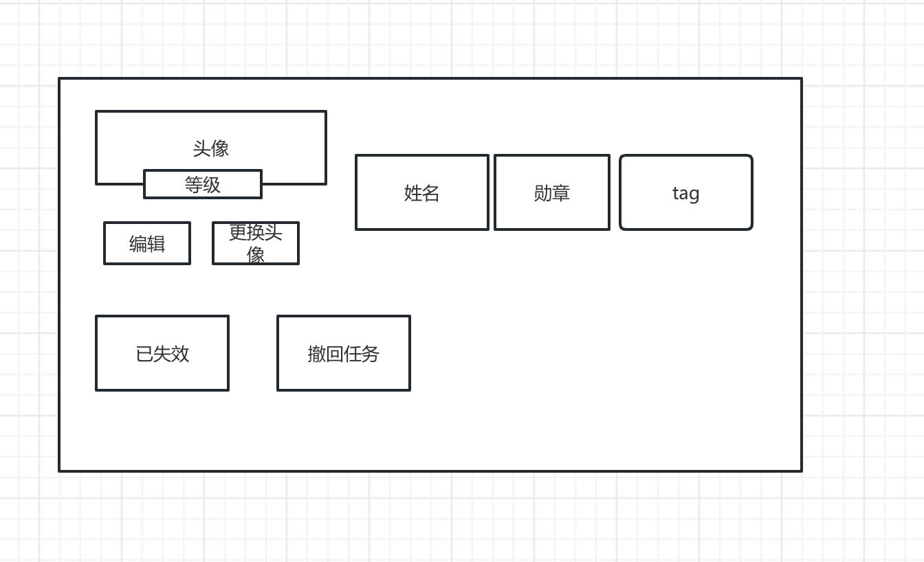
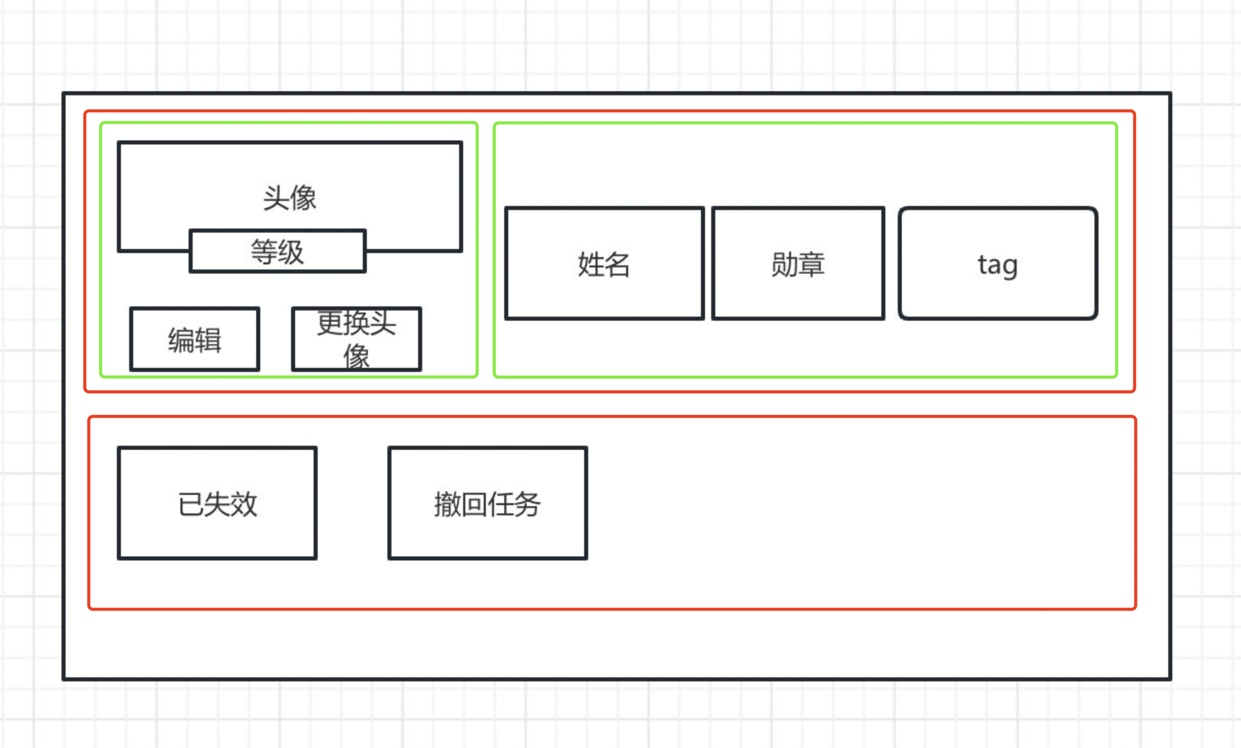
十、个人信息布局 - 样式一
场景原型:
Preview
场景思路:
Preview
场景解决:
实时编辑器
function Test(props) {
  const container = {
    width: '100%',
  }
  const content = {

  }
  const contentTop = {
    display: "flex",
    justifyContent: "flex-start",
    alignItems: "center",
    marginBottom: "24px"
  }
  const contentTopLeft = {
    marginRight: "24px"
  }
  const contentTopRight = {
    display: "flex",
    justifyContent: "flex-start",
    alignItems: "center"
  }
  const avatarContainer = {
    width: "100px",
    height: "80px",
    position: "relative",
    margin: "0 auto"
  }
  const avatarContainerOperation = {
    display: "flex",
    justifyContent: "flex-start",
    alignItems: "center"
  }
  const avatar = {
    width: "60px",
    height: "60px",
    textAlign: "center",
    lineHeight: "60px",
    borderRadius: "50%",
    backgroundColor: "red",
    margin: "0 auto"
  }
  const level = {
    width: "80px",
    position: "absolute",
    left: "50%",
    bottom: "0px",
    transform: "translate(-50%,-50%)",
    textAlign: "center",
    backgroundColor: "blue"
  }
  const edit = {
    width: "80px",
    height: "44px",
    textAlign: "center",
    lineHeight: "44px",
    backgroundColor: "yellow",
    borderRadius: "4",
    marginRight: "4px"
  }
  const change = {
    width: "80px",
    height: "44px",
    textAlign: "center",
    lineHeight: "44px",
    backgroundColor: "yellow",
    borderRadius: "4"
  }
  const name = {
    width: "80px",
    height: "44px",
    textAlign: "center",
    lineHeight: "44px",
    backgroundColor: "yellow",
    borderRadius: "4",
    marginRight: "8px"
  }
  const medal = {
    width: "80px",
    height: "44px",
    textAlign: "center",
    lineHeight: "44px",
    backgroundColor: "yellow",
    borderRadius: "4",
    marginRight: "8px"
  }
  const tag = {
    width: "80px",
    height: "44px",
    textAlign: "center",
    lineHeight: "44px",
    backgroundColor: "yellow",
    borderRadius: "4",
  }
  const contentBottom = {
    display: "flex",
    justifyContent: "flex-start",
    alignItems: "center"
  }

  return (
     <div style={ container }>
       <div style={ content }>
        <div style={ contentTop }>
            <div style={ contentTopLeft }>
                <div style={ avatarContainer }>
                    <div style={ avatar }>头像</div>
                    <div style={ level }>Level 21</div>
                </div>
                <div style={ avatarContainerOperation }>
                    <div style={ edit } >编辑</div>
                    <div style={ change } >更换头像</div>
                </div>
            </div>
            <div style={ contentTopRight }>
                <div style={name}>姓名</div>
                <div style={medal}>勋章</div>
                <div style={tag}>Tag</div>
            </div>
        </div>
        <div style={ contentBottom }>
            <div style={ name }>已失效</div>
            <div style={ name }>撤回任务</div>
        </div>
       </div>
     </div>
  );
}
结果
Loading...